What does it take to turn an idea into a poem? Into a story, a polemic or a play? That, I’m afraid, I can’t answer fully, though time, skill, experience – and imagination – are obvious prerequisites.
But what does it take to turn those poems, stories, plays and polemics – or a long forgotten manuscript – into a beautiful piece of hand-crafted print?
Well, I went to Oldham recently, to find out.
There I found a den of creativity, skill and craftsmanship. Delightfully distracting clutter. And two cute dogs.
Yes, I know this is about making things, but I’m sure the dogs are part of the broader creative process.
For the Incline Press is not just about finding things and printing them, about craftsmanship and beauty – though it is about those things.
No, it’s about inspiration.
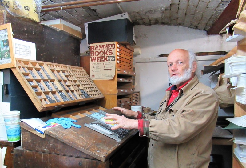
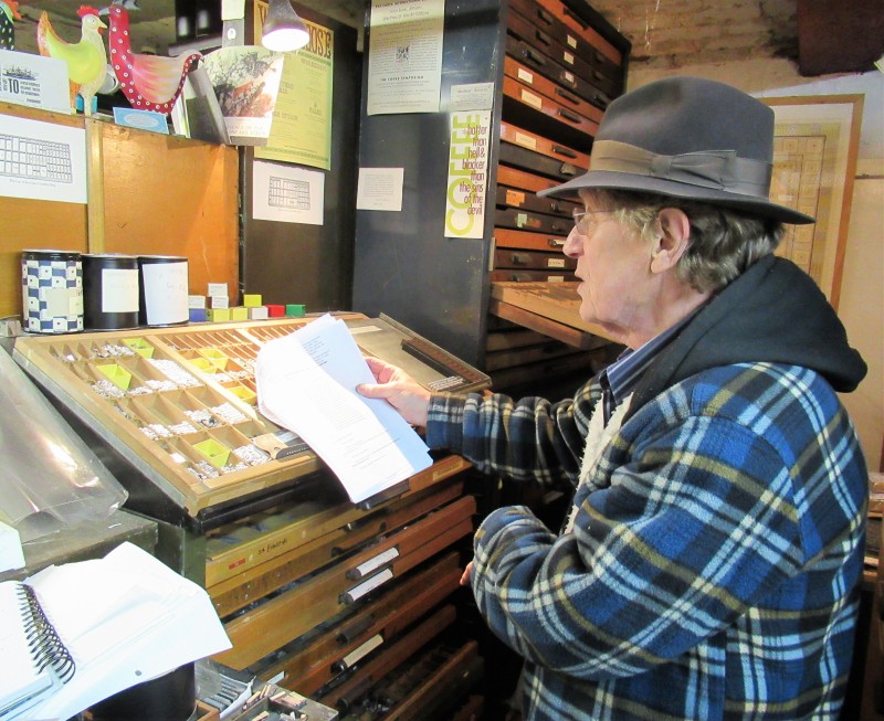
As the man behind the undertaking, Graham Moss, said to me, ‘I start with an idea. A book or a story. And a breadth of knowledge of the world.’
He always works to a design, not a budget. An admirable – and enviable – position to take in this cost-conscious world. And I suspect it’s what makes the Incline Press’s publications so touchable, readable, visually captivating – and collectable.
But I’m getting ahead of myself. Let’s start at the very beginning …
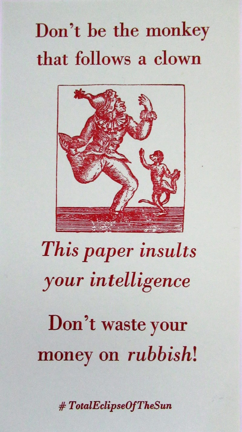
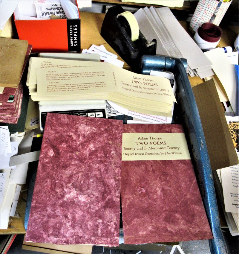
Delve around the paper lying in heaps around the densely packed premises and you find works of literature mingling with quirkily illustrated ephemera. Polite requests not to park here. Recommendations that you don’t waste time and money buying the Sun.

Labels for marmalade sitting side-by-side with a Shakespeare sonnet, an Anthony Burgess poem.
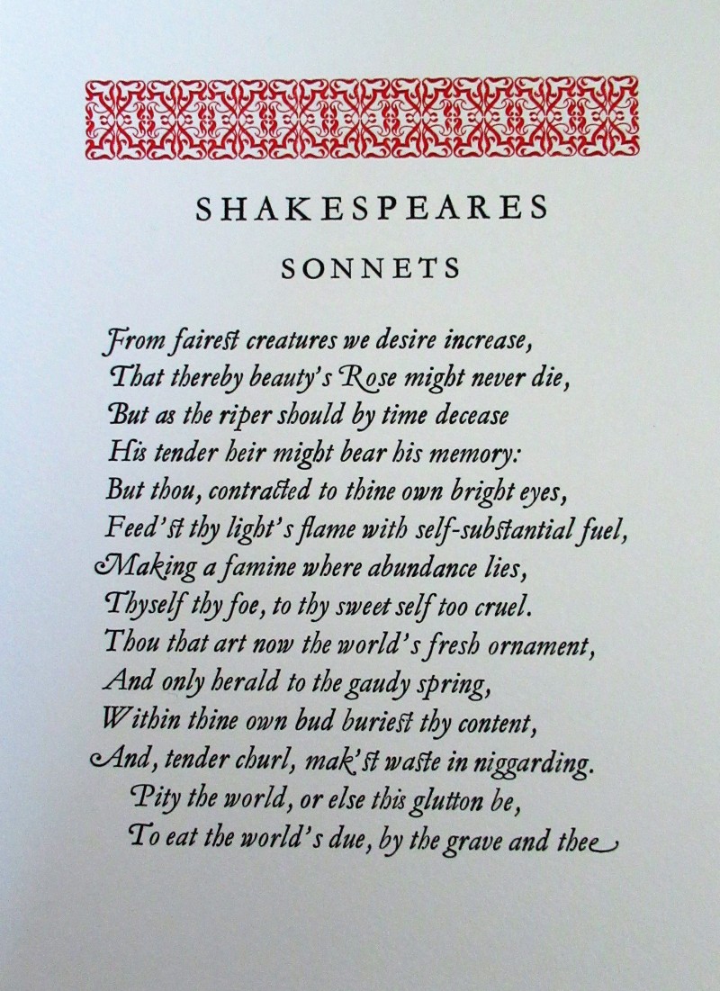
Look closely and you will see that some letters are actually just one piece of type – like the ‘st’ in Feed’st – and that some of the capital letters are different forms of the same letter. A term applied to the sweeping tail of the R in rose is, I believe, swash. This was submitted by Kathy Whalen at Incline for the Bodleian Library on the 400th

Lines from an unpublished poem ‘An Essay On Censorship’ by Anthony Burgess, portrait by John Watson

 No matter whether ephemeral or bardic, each piece is designed and produced with the same attention to detail and careful choice of type. To the quality of paper. To the integrity of the pictures – or illustrations (your choice, semantics matter and I take no position on this one, other than to say I suppose it depends on context).
The press uses lead type (which Skipper, one of the dogs, loves to crunch).

Yes, that’s Skipper, looking innocent
Graham bought up the stock of the last British foundry to make metal type when it closed. That was more than fifteen years ago and much of it still sits in its brown paper packaging, neatly stacked, awaiting its call.

But plenty more is in use. And some of it designed and produced for the press.
Baker, for example, is a typeface based on lettering inscribed on the tomb of a Roman baker. An American ‘pal’ of Graham’s turned the incised letters into a typeface, had them cast, shipped them over. And, voilà, they are now forming words, being read and understood, creating mental images, stimulating thought processes in the minds of Incline Press’s readers.

A tour around – well, a careful-stepping-around – is a rapid tutorial on printing terminology, much of which has gone in one ear and out the other, I am ashamed to say. My host was so full of arcane knowledge and anecdotes that I have half notes, interrupted by further interesting facts, quotations and insights as they tumbled out in profusion.
But I think I can convey the basics. And with a little help, get them right.
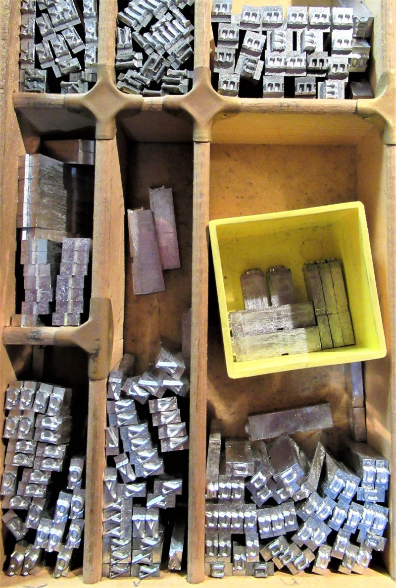
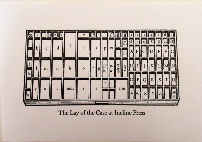
I do recall that the desk on which the type is set is called a random.
And on that desk are placed the cases holding the type. There used to be separate cases for holding the upper case – majuscule – letters and lower case – minuscule – letters.
Graham telling me about the upper and lower cases (not pretending to play the piano!)
The capitals were used less often and the case which held them was positioned above the setter, or compositor, and the case containing the minuscule letters was on the desk – hence ‘upper case’ and ‘lower case’.
Within the case, the letters were arranged – are arranged – with those used most frequently nearest to hand at the centre. Thus, ‘e’ is slap bang in the middle, with ’a’ and ‘t’ close by.
When mechanical compositors were invented in the late nineteenth century the cases were combined into one.
The illustration shows how Incline Press’s own cases are organised.
A font, by the way, is not, as commonly assumed, the design of an individual typeface. No, it is the full set of that type. A box of a standard-sized font weighs in at seven imperial pounds. The bigger the type, the fewer letters you get for your seven pounds.

Graham is holding a box containing a font

‘Leading’ being added to space lines of type – that’s how it gets its name
Mike, Graham’s colleague, tried to model the holding of the composing stick, where type and leading – lines of lead to space the lines of type – is set. But the stick was designed for god-fearing right handers, not sinister lefties, like Mike, and all I could see was his hand. So the picture shows Graham instead.
There is a real knack to using this stick. I did not attempt it.
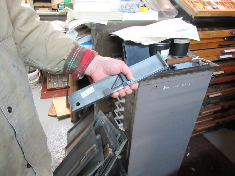
Nor will I step into the quagmire of ems and other spaces. Except to say, as told repeatedly by Graham, that there are six ems to an inch.

Note the design of this type scale rule which has a handy notch at the edge for keeping it in place
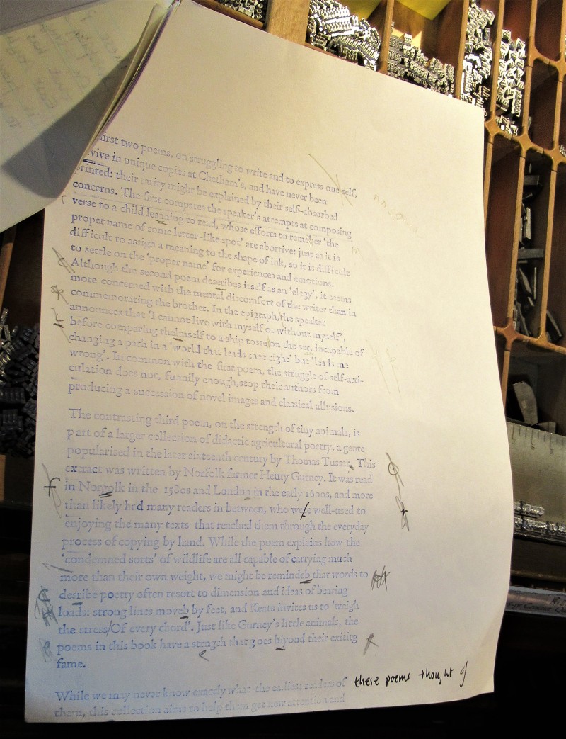
Once the type has been composed it is moved into a galley – an oblong tray, usually metal, that is open at one end.
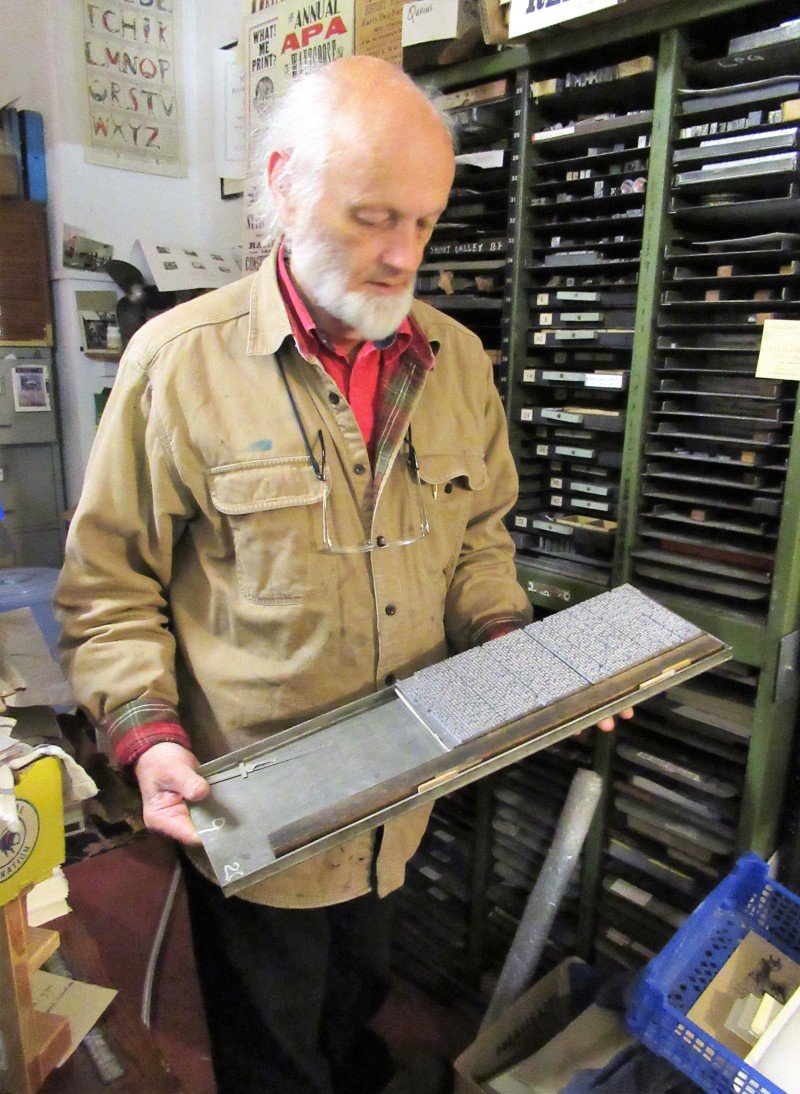
This goes in the press and a first print is made to ‘prove’ whether it is correct – hence – proof. Those of you who have produced printed work will also recognise the term ‘galley proof’. A long strip, a column of text, rather than a page.
The one Mike is working on in the picture below had been meticulously annotated – marked up – by Graham and I envied his patently deep stores of patience. Not my finest quality.
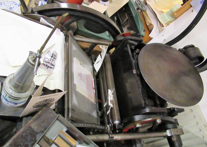
The press has two main printing presses in use today. One a treadle operated clam press – the method of printing using the round plate you can see in the picture – bought from the widow of a Welsh Methodist printer.
This ‘Arab’ press was manufactured by Josiah Wade of Halifax. Production began in the 1870s and the presses were still being sold by their last agent in the 1960s, the only ‘improvement’ being the addition of integral motors.

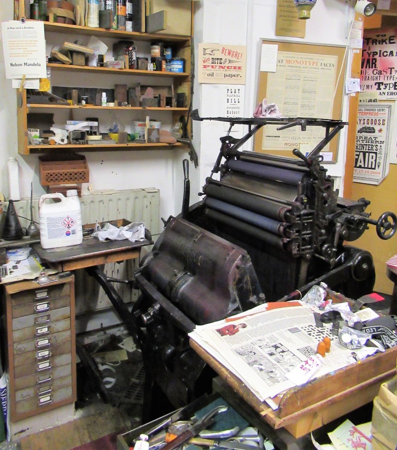
The other press is an electrically powered parallel press which was originally imported by Eric Gill. Yes, that Eric Gill, who learned the art of incising lettering in stone and later came to typeface design. Known for Gill Sans, he also created Perpetua, Golden Cockerel, Solus, Perpetua Greek, Joanna, Aries, Jubilee, Bunyan, Hebrew and Arabic (which my book describes as ‘not cut’).
The book, by the way (skip this if you like, it’s a short personal diversion) is Eric Gill’s autobiography and was given to my father by my mother for Christmas in 1941. There are sections marked in pencil – and as far as I can see they mostly relate to Catholicism. Tucked inside the cover is a review of ‘The Engravings of Eric Gill’, price £110, from 1983. He didn’t get that one for Christmas.
But back to Incline. About which there is much, much more to say.
The beautiful paper.
Amate from South America made of bark.
Gorgeous marbled designs destined to be end papers.

The terminology – how a little piece of print about the fox (and politics) is a ‘work work and turn’ because it has to be printed in three separate goes.

How printing was regarded as forgery by the religious who had made script their own exclusive domain. Machines were forging the real word, the handwritten word.
How Mike claims to be the Printer’s Devil – the young boy who carries the pints and pies and ink pads. The picture tells a different story. And he carried no pies or pints when I was there. (I suspect the truth is, he’s working his apprenticeship.)


How Graham ponders whether printing, which combines brain work and muscle work, was the first truly industrial process to emerge in Europe. After all, Gutenberg was printing by machine by 1450, which is, indeed a long time before the so-called industrial revolution.
How the nineteenth century building that houses the press, once a small cotton mill, is ‘fireproof’. No wood was used in its construction, rather brick, stone, rubble and metal – which won’t catch fire.
And now it’s full of paper. Which probably would.


And how Skipper and Red, the rescue dogs, are fluffy bundles of joy and obviously besotted with their master.
And rats.
And type, in Skipper’s case.

Red, almost (not quite) still for one brief moment
But your patience will be wearing thin by now, so I will finish by letting Graham say a few words as he shows you his electric press in operation.
Um. The only thing is, I took the video in portrait format and can’t (without learning a new technique and downloading software) turn it upright. So, prepare to crick your neck if you are reading this on a desktop.
And when you’ve recovered, here’s a link to the Press, which has an online catalogue – so, go on, why not treat yourself?
http://www.inclinepress.com/index.html

This is a good clear explanation of the typesetting and printing process if you’d like more:
https://www.britannica.com/topic/printing-publishing/Modern-printing-techniques

I did enjoy that…I could almost smell the place!
LikeLiked by 1 person
Thanks Helen. It’s a mix of ink and paper and metal with a tiny touch of dog isn’t it? It’s been a while since I was blogging here, I became a bit mill-steam-engine-centric and hope to do a bit more varied stuff this summer. Thanks for following!
LikeLiked by 1 person
The pleasure is all mine.
I was working at a time when old trades were disappearing like water on a hotplate, but was fortunate enough to meet the people who had served those trades and who, in many cases, were fascinated by their history.
I also used to spin and weave for many years….I nearly bought a Jaquard loom but came to my senses in time!
LikeLiked by 1 person
So I’m guessing you looked at the mill posts! I am still so steamed up about the mills closing for the lack of £3 million a year. Still no definite news and still closed. Britain’s industrial heritage – if it were a house a famous author had lived in for ten minutes in London the luvvies would have raised that ten times over by now. . Grrrr. But yes, probably a good thing you didn’t invest in the loom!! And I like that expression – water on a hotplate.
LikeLiked by 1 person
Excellent – thank you
LikeLiked by 1 person
Glad you enjoyed it, the visit was a rare treat – like being in a really good stationery shop but better!
LikeLike
“Don’t be the monkey that follows a clown” – love it! Graham is not just an excellent craftsman, he’s one that uses his talent to pursue a progressive political agenda. Two for the price of one.
LikeLiked by 1 person
Indeed – rather reassuring to find political messages being put politely, firmly, intelligently and also beautifully! A friend challenged me to use the Sun card on a certain other ‘Daily’ paper at my local newsagent but as I only have one and ma a coward I am refusing the challenge 🙂 Thanks for popping by. (PS: If you like the politics in this one you might like ‘Not even a pot to piss in’.)
LikeLike
Really interesting, Mary. Traditional printing is so onerous and time-consuming, yet was an enormous advance on handwriting (and engraving) every copy. No wonder the Catholic church were terrified of it! Because it was possible to print Bibles, printing had at least as big a role in Protestantism as Luther, Calvin and all the reformers.
Really interesting about how the all the fonts came about too, and how the tray of letters is arranged.
This is what really interests me, how industry and technology affects the course of history.
LikeLiked by 1 person
Thanks Rosemary and glad you enjoyed it. It was a fascinating little trip. I can’t remember if I put it into my ‘From weft to rights’ post on here but I came across an ancient pamphlet of my father’s – an extract from the diary of John Ward, weaver, of Clitheroe. It was an eye opener for me – how the man would trudge for miles in inclement weather to meet other weavers to try and agree how to cope with industrialisation, and more surprisingly to me, to read newspapers. He reported on the progress of the American civil war – which of course affected the cotton industry in Lancashire severely – much as he wrote about the price of new potatoes – both very necessary information for him. If it’s your kind of thing I recommend googling it as there are others too, ordinary working diarists really demonstrating how global changes altered their lives, one minute a skilled craftsman, next a cog in a machine. Plus ca change!
Thanks again for dropping in to this site.
LikeLiked by 1 person
What a fascinating trip through a printer’s shop! And I love their designs, particularly the anti-Sun sign!
LikeLiked by 1 person